

Effective ways to visualise data are essential in numerical weather prediction (NWP). Technological advances offer exciting possibilities, but some things have changed little since the early days of forecasting.
Imagine what numerical weather prediction would be like if there were no visualisation. If we could just use words and numbers to analyse climate and weather, build and communicate forecasts, and develop and evaluate the forecasting system.
The amount of data processed and produced by modern NWP models is so vast that it can be difficult to make sense of them without casting them into some visual form. Just consider maps. How much detail about the geographic distribution of weather parameters and their change over time can you convey without resorting to them?
Weather forecasters addressing the public have always recognized the value of visualising data. As this slide show demonstrates, maps showing isobars and weather fronts were used in the first televised BBC forecasts more than 60 years ago – and similar maps continue to be used today.
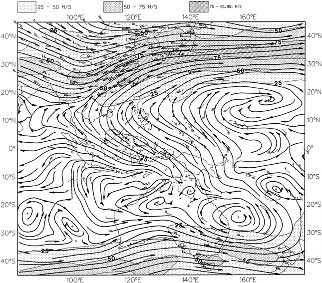
Maps have long been a staple of visualisation in meteorology. This ECMWF wind analysis chart for Thursday 29 January 1987 00 UTC combines a representation of wind direction at 200 hPa (arrows) with information on wind speed (shading).
Forecast plumes
Some developments over the last few decades have called for new visualisation methods. One of them is probabilistic forecasting. In this approach, the forecasting model is run with a range of slightly different initial conditions and model configurations. The resulting ‘ensemble’ of forecasts can give an idea of the range of possible weather outcomes, and of how likely they are.
One way of conveying this information is through charts in which each forecast is represented by a line. The resulting forecast plume shows not just what the different forecasts predict, but also how far they are spread apart at different forecast times. This can give a sense of how much confidence we can have in particular predictions.
Ensemble distributions can also be visualised by using shading to group together forecasts making similar kinds of prediction.
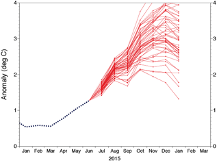
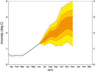
Forecast plumes are used here to visualise the spread of long-range El Niño forecasts. The left-hand panel shows ECMWF ensemble forecasts of sea-surface temperature anomalies over the NINO3.4 region in the central-eastern equatorial Pacific, produced on 1 July 2015. The right-hand panel shows the calibrated EUROSIP forecast produced on 1 July 2015 from the ensembles provided by four different forecasting centres: ECMWF, the UK Met Office, Météo-France and the US National Centers for Environmental Prediction.
Another way to visualise ensemble forecasts is to show the ensemble member distribution at successive times for which forecasts are made by a box-and-whiskers diagram. At ECMWF, these diagrams show the median (short horizontal line), the 25th and 75th percentiles (wide vertical box), the 10th and 90th percentiles (narrower boxes) and the minimum and maximum predicted values (vertical lines). These ‘ENS Meteograms’ can be used to show the predicted evolution of a wide range of parameters.
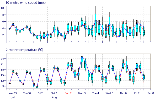
ECMWF’s ENS Meteogram for Reading, UK, starting on 29 July 2015 00 UTC. The blue lines show the high-resolution forecast (16 km horizontal resolution) and the dashed red lines show the same forecast run at the lower ensemble forecast resolution of 31 km.
Animations
Animations can be very effective to visualise change over time. They can be used to condense vast amounts of data into memorable visual sequences.
This ECMWF animation presents more than 1,000 gigabytes of climate data in a 22-second sequence which shows how global temperatures changed between 1900 and 2010 compared to the 20th-century average. The animation is based on ERA-20CM, a set of extended model runs covering the 20th century.
Animations can also be used to visualise gradual changes in sea ice cover over periods ranging from months to decades.

An animation produced by the European Space Agency (ESA) shows changes in Arctic sea ice cover between 1980 and 2010.
Interactivity
A growing area of visualisation is the use of interactive displays, where users have some control over what kind of information they see, and in what form. This approach is particularly well suited for the web.
At ECMWF, a ‘Weather Wall’ made up of 12 large display panels can be manipulated by members of staff or visitors to show different kinds of visualisation, facilitating discussions of meteorological issues.
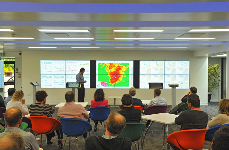
ECMWF’s Weather Wall is used to communicate and assess our model performance.
Week of events
Modern computer technology offers a lot of scope to visualise the data produced by forecasting centres. The creative challenge is to harness it to communicate weather and climate information clearly and in ways that are relevant to the target audience.
The latest approaches to visualisation in meteorology will be showcased and discussed during a week of events hosted by ECMWF from 28 September to 2 October 2015.

Four meetings will take place that week: the biennial workshop on ‘Meteorological Operational Systems’ (MOS); the annual meeting of the European Working Group on Operational meteorological Workstations (EGOWS); a Royal Meteorological Society Seminar on ‘The visualization of meteorological data’; and a Plugfest of the MetOcean Domain Working Group of the Open Geospatial Consortium (OGC) for web map and coverage services.
These meetings will review state-of-the-art ways of communicating forecasts in operational and research environments in graphical form. The presentations will be accompanied by an exhibition of visualisation systems.
User registration will remain open until 28 August.
